Step 1: Set up a new React application
If you don’t have a React application set up already, you can create one using Create React App. Open your terminal and run the following command:
npx create-react-app responsive-navigation
cd responsive-navigation
Step 2: Install Tailwind CSS
Next, you’ll need to install Tailwind CSS and its dependencies. Run the following command in your project directory:
npm install tailwindcss postcss-cli autoprefixerStep 3: Set up Tailwind CSS configuration
Create a new file named tailwind.config.js in your project’s root folder. Add the following content to it:
module.exports = {
  purge: ['./src/**/*.{js,jsx,ts,tsx}', './public/index.html'],
  darkMode: false,
  theme: {
    extend: {},
  },
  variants: {
    extend: {},
  },
  plugins: [],
};Now, let’s create a new React component for the navigation. In the src folder, create a new file called Navbar.js and add the following content:
import React, { useState } from 'react';

const Navbar = () => {
  const [isOpen, setIsOpen] = useState(false);

  const toggleMenu = () => {
    setIsOpen(!isOpen);
  };

  return (
    <nav className="bg-gray-800 p-4">
      <div className="max-w-7xl mx-auto">
        <div className="flex justify-between">
          <div className="flex items-center">
            <span className="text-white font-semibold text-lg">Your Logo</span>
          </div>
          <div className="hidden md:flex space-x-4">
            <a href="#" className="text-gray-300 hover:bg-gray-700 px-3 py-2 rounded-md text-sm font-medium">
              Home
            </a>
            <a href="#" className="text-gray-300 hover:bg-gray-700 px-3 py-2 rounded-md text-sm font-medium">
              About
            </a>
            <a href="#" className="text-gray-300 hover:bg-gray-700 px-3 py-2 rounded-md text-sm font-medium">
              Services
            </a>
            {/* Add more links here */}
          </div>
          <div className="md:hidden flex items-center">
            <button
              onClick={toggleMenu}
              className="text-gray-300 hover:text-white focus:outline-none focus:text-white"
            >
              <svg
                className="h-6 w-6 fill-current"
                viewBox="0 0 24 24"
                xmlns="http://www.w3.org/2000/svg"
              >
                {isOpen ? (
                  <path
                    fillRule="evenodd"
                    clipRule="evenodd"
                    d="M3 18C2.44772 18 2 17.5523 2 17C2 16.4477 2.44772 16 3 16H21C21.5523 16 22 16.4477 22 17C22 17.5523 21.5523 18 21 18H3ZM3 11C2.44772 11 2 10.5523 2 10C2 9.44771 2.44772 9 3 9H21C21.5523 9 22 9.44771 22 10C22 10.5523 21.5523 11 21 11H3ZM3 4C2.44772 4 2 4.44772 2 5C2 5.55228 2.44772 6 3 6H21C21.5523 6 22 5.55228 22 5C22 4.44772 21.5523 4 21 4H3Z"
                    fill="white"
                  />
                ) : (
                  <path
                    fillRule="evenodd"
                    clipRule="evenodd"
                    d="M4 18C3.44772 18 3 17.5523 3 17C3 16.4477 3.44772 16 4 16H20C20.5523 16 21 16.4477 21 17C21 17.5523 20.5523 18 20 18H4ZM4 11C3.44772 11 3 10.5523 3 10C3 9.44771 3.44772 9 4 9H20C20.5523 9 21 9.44771 21 10C21 10.5523 20.5523 11 20 11H4ZM4 4C3.44772 4 3 4.44772 3 5C3 5.55228 3.44772 6 4 6H20C20.5523 6 21 5.55228 21 5C21 4.44772 20.5523 4 20 4H4Z"
                    fill="white"
                  />
                )}
              </svg>
            </button>
          </div>
        </div>
      </div>
      {isOpen && (
        <div className="md:hidden">
          <div className="px-2 pt-2 pb-3 space-y-1 sm:px-3">
            <a
              href="#"
              className="text-gray-300 hover:bg-gray-700 block px-3 py-2 rounded-md text-base font-medium"
            >
              Home
            </a>
            <a
              href="#"
              className="text-gray-300 hover:bg-gray-700 block px-3 py-2 rounded-md text-base font-medium"
            >
              About
            </a>
            <a
              href="#"
              className="text-gray-300 hover:bg-gray-700 block px-3 py-2 rounded-md text-base font-medium"
            >
              Services
            </a>
            {/* Add more links here */}
          </div>
        </div>
      )}
    </nav>
  );
};

export default Navbar;Open the App.js file in the src folder and import the Navbar component. Then, include it in your app’s layout.
import React from 'react';
import Navbar from './Navbar';

function App() {
  return (
    <div>
      <Navbar />
      {/* Your other app content goes here */}
    </div>
  );
}

export default App;
Step 6: Start the development server
Finally, you can start the development server and see the responsive navigation in action by running the following command:
npm startNow you should have a fully functional responsive navigation
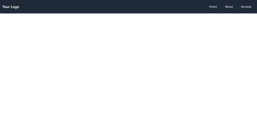
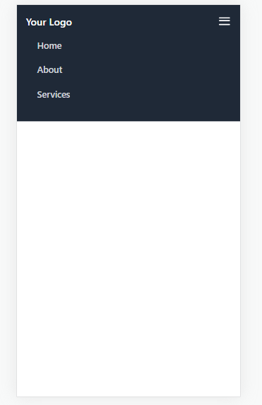
Output: